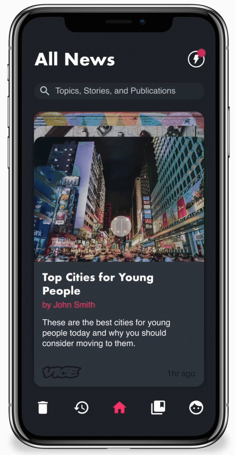
Making News Actionable
News is typically presented today as a never ending feed. People endlessly scroll to the bottom to see if they missed something interesting even if it isn't relevant anymore. News Deck avoids this by presenting news as a finite deck of cards which are intuitive to sort and interact with.


Getting Insights
In addition to making news more actionable, news deck will actively make suggestions for how the user can reduce the amount of news in their feed. These "Insights" are based on user behavior and can either be acted on or dismissed.
Tailoring the Experience
The user can manage the topics and publications they are subscribed to, in order to tailor their feed to their interests.
The Dashboard
While News Deck is designed for mobile first as it is the primary platform for news consumption, the experience on a desktop has been considered as well.
Workflow
This entire project was an exploration in using InVision Studio as part of the product design process. This was my first project using Studio and the entire design, prototype, and animations were done in the software
